Data Interpretation (DI) means understanding data and answering questions from it.
In UGC NET Paper 1, DI is not about heavy maths. It is about smart reading, quick comparison, and clean calculation.
In Real Life: You use DI when you read a phone’s battery chart, compare product ratings, or understand election results.
Exam Point of View: You must read graphs/tables fast, pick the right values, and calculate accurately in less time.
Official Syllabus Snapshot (Unit 7)
Unit 7 includes the following topics in the official Paper 1 syllabus:
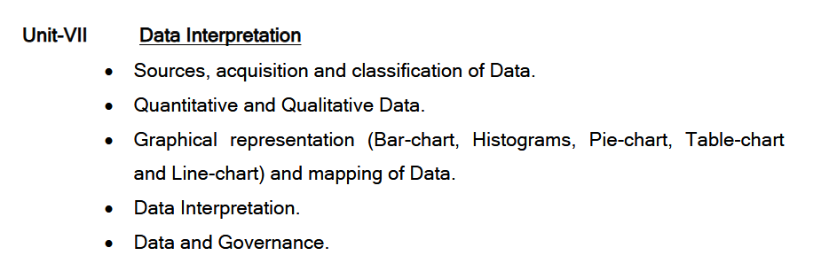
- Sources, acquisition and classification of data
- Quantitative and qualitative data
- Graphical representation (bar chart, histogram, pie chart, table chart, line chart) and mapping of data
- Data interpretation
- Data and governance
Exam Point of View: Paper 1 is designed to ask around five questions (2 marks each) from each unit/module, so Unit 7 is a solid scoring area if your basics are strong.
What DI Really Tests
DI mainly tests these 4 skills:
- Reading Skill: Can you locate the correct number from a table/graph?
- Comparison Skill: Can you quickly tell “highest/lowest”, “more/less”, “increase/decrease”?
- Calculation Skill: Can you find percentage, ratio, average, difference, and change?
- Judgement Skill: Can you avoid silly mistakes (units, year, legend, totals, wrong column)?
Tip: Most DI mistakes happen because students rush and read the wrong row/column, not because the calculation is hard.
Core Data Basics You Must Know
- Data: Raw facts (numbers/words) collected for a purpose.
- Information: Data after meaning is added (example: “Sales increased by 20%”).
- Dataset: A full set of related data (like marks of 100 students).
- Variable: A value that can change (marks, age, salary).
- Observation: One record/entry (like one student’s full row in a table).
Exam Point of View: If you understand these 5 words clearly, concept-based DI questions become easy.
Sources, Acquisition, and Classification of Data
Sources of Data
- Primary Data: Collected first-hand by you.
Example: Survey, interview, questionnaire, observation. - Secondary Data: Already collected by someone else.
Example: Census reports, government portals, books, research papers, company reports.
Exam Point of View: Many questions are direct: “Which is primary/secondary?” or “Which source suits this situation?”
Acquisition of Data (How Data is Collected)
Common methods:
- Surveys (online/offline)
- Interviews
- Observation
- Experiments
- Using existing databases/reports (secondary)
Tip: When the question gives a situation, your job is to pick the most suitable method.
Classification of Data (How We Group Data)
- By Nature: Quantitative / Qualitative
- By Time:
- Cross-sectional: One time point (survey in 2025)
- Time series: Multiple time points (2019–2025 sales)
- By Variables:
- Univariate: One variable (only marks)
- Bivariate: Two variables (marks + attendance)
- Multivariate: Many variables (marks + attendance + gender + region)
- By Measurement Scale (Very Common in exams):
- Nominal: Names only (blood group, city)
- Ordinal: Order matters (rank, grade)
- Interval: Equal gaps, no true zero (temperature in °C)
- Ratio: Equal gaps + true zero (height, weight, income)
Exam Point of View: “Rank” looks like a number, but concept-wise it is usually ordinal (qualitative with order).
Quantitative vs Qualitative Data (Most Asked Concept)
- Quantitative Data: Number-based data you can calculate on.
Example: 45 students, 78 marks, 12 km, 35%. - Qualitative Data: Category/quality-based data described in words or groups.
Example: Good/Bad, Male/Female, Rural/Urban, Satisfied/Not satisfied.
How they connect: Qualitative data can be converted into numbers for analysis.
Example: Satisfaction survey → Satisfied = 1, Not satisfied = 0.
Situational Example: A college wants to improve library services.
Answer:
- Qualitative data: “Books are old”, “timing is short”, “staff is helpful”
- Quantitative data: visitors per day, book-issue count, average waiting time
Explanation: Qualitative tells what the problem is, quantitative tells how big the problem is.
Graphical Representation and Mapping of Data
In DI, graphs help you see data quickly and compare easily. Unit 7 mentions bar chart, histogram, pie chart, table chart, line chart, and mapping of data.
- Bar Chart: Compares categories (A vs B vs C).
Used for: Sales by brand, marks by subject, population by state.
Key idea: Compare bar height/length correctly. - Pie Chart: Shows parts of a whole (total = 100%).
Used for: Budget share, market share, time distribution.
Key idea:
Formula: Value = (Percentage/100) × Total - Histogram: Shows frequency for continuous data ranges (0–10, 10–20…).
Used for: Distribution of marks/age/weights.
Key idea: Bars touch because ranges are continuous. - Line Chart: Shows trend over time.
Used for: Growth/decline from year to year.
Key idea: Focus on rise/fall and steep changes. - Table Chart: Rows + columns (most direct).
Key idea: Many traps are hidden in headings (row/column labels). - Mapping of Data: Shows values on a map (regions/states/districts).
Used for: Rainfall by state, literacy by district, cases by region.
Common term: Choropleth map (dark = high value, light = low value).
Step-by-Step Method to Solve Any DI Question
- Step 1: Read the title and time period (year/month/quarter).
- Step 2: Check units (₹, %, lakhs, millions, kg, marks).
- Step 3: Identify legend/colors (especially in multiple bars or pie charts).
- Step 4: Locate the exact value (row + column + year).
- Step 5: Decide the operation (difference, ratio, average, % change).
- Step 6: Calculate and re-check units.
Golden Rule: If the question says “percentage,” your final answer must be in “%”, not a raw number.
Must-Know Calculation Toolkit for UGC NET DI
- Percentage:
Formula: Percentage = (Part/Total) × 100 - Percentage Change:
Formula: % Change = (New − Old)/Old × 100 - Average:
Formula: Average = Sum of values / Number of values - Ratio:
Meaning: 2:3 means 2 parts vs 3 parts.
Tip: Reduce ratios early by dividing both sides by the same number.
Fraction to Percentage (Quick Memory):
- 1/2 = 50%
- 1/3 ≈ 33.33%
- 2/3 ≈ 66.67%
- 1/4 = 25%
- 3/4 = 75%
- 1/5 = 20%
- 1/8 = 12.5%
- 1/10 = 10%
Approximation (To Save Time): If options are far apart, round values and match the nearest option.
Data and Governance
Data and Governance means how governments and institutions use data to plan, monitor, and improve public services.
Examples:
- Using census data to plan schools and hospitals
- Using pollution data to create environmental rules
- Using employment data to design skill programs
Exam Point of View: Expect simple concept questions like “Why data matters in policy?” or “What is evidence-based decision making?”
What Kind of Questions Come from Unit 7
- Direct Reading: “What is the value in 2023 for category B?”
- Comparison: “Which is highest/lowest?”
- Simple Calculations: difference, total, average, percentage, ratio
- Trend Based: “In which year was growth maximum?”
- Pie Chart Conversions: percent ↔ value
- Histogram Understanding: frequency, class interval, distribution idea
- Concept Questions: primary vs secondary, qualitative vs quantitative, measurement scales
- Data Governance: basic meaning and use
Speed Strategy (Exam Hall Rules)
- Rule 1: Do not calculate before locating the correct numbers.
- Rule 2: Mark units on rough sheet (₹, %, lakhs).
- Rule 3: Use options to eliminate wrong ones quickly.
- Rule 4: For pie charts, find the total first (if needed).
- Rule 5: If a question is heavy, skip and return (Paper 1 is time-bound).
Common Mistakes (And How to Avoid Them)
- Mistake 1: Reading the wrong year/column.
Fix: Underline the year/category in the question first. - Mistake 2: Ignoring units (₹ vs %, lakh vs thousand).
Fix: Write the unit next to the value on the rough sheet. - Mistake 3: Doing full calculation when approximation is enough.
Fix: Check options first; round values if options are far. - Mistake 4: Treating histogram like bar chart.
Fix: Histogram is for continuous ranges + frequency distribution.
Quick Revision Checklist (Before Any Mock Test)
- Check 1: Can you explain quantitative vs qualitative with 2 examples each?
- Check 2: Can you identify primary vs secondary data in 5 seconds?
- Check 3: Can you convert pie chart percent into value quickly?
- Check 4: Do you remember % change and average formulas?
- Check 5: Can you read legends, axes, and units without mistakes?
Exam Point of View: DI improves fastest when you track your mistakes daily. One error repeated 5 times becomes 5 marks lost in the real exam.
Daily Practice (Daily 1 DI) + Error Log Method
A “DI set” means one data set (table/graph) + 4–6 questions.
Daily Routine (20–30 minutes):
- Warm-up: revise 6 quick percentages (10%, 12.5%, 15%, 20%, 25%, 33.33%)
- Read DI first: title + units + legend + years/categories
- Solve 1 DI set (timed): 4–6 questions
- Error Log: note mistakes and fix them
- Retry: solve wrong questions again without seeing the answer
- One concept revision: bar vs histogram / % vs percentage points / qualitative vs quantitative
What to write in your DI Error Log (Very Important)
- Mistake Type: Reading / Unit / Calculation / Concept / Time pressure
- Exact Reason: missed “₹ in lakhs”, read wrong bar, used % instead of percentage points
- Fix Rule: one clear rule like “Always check unit before calculation.”
Optional Variety: Rotate the DI format daily: Table / Bar / Pie / Line / Histogram / Mixed
Tricks to Follow While Doing DI in the Exam
- Read the chart language first
Trick: Spend 10 seconds on title + unit + scale + legend + time period.
Why: Most DI errors happen due to wrong reading, not wrong maths.
Exam Point of View: If units are “₹ in lakhs” and you treat them as “₹”, your whole answer becomes wrong. - Find the base of the question
Trick: Identify whether it asks value / total / difference / ratio / percentage / change.
Why: You choose the right operation and avoid extra work. - Use option elimination before calculation
Trick: If options are far apart, eliminate 2 options quickly using rough estimation.
Why: NET DI is designed for speed. - Do a 2-second sanity estimate
Trick: Ask: “Should it be around 20% or 60%?”
Why: It catches wrong denominators and decimal mistakes. - Avoid full totals when not needed
Trick: For “highest/lowest” questions, compare directly instead of summing all.
Why: Many questions are pure comparison. - Use fraction shortcuts for common percentages
Trick: 50%=1/2, 25%=1/4, 20%=1/5, 12.5%=1/8, 33.33%≈1/3, 66.66%≈2/3.
Why: Fractions are faster than multiplying by 100. - Separate percent increase and percentage points
Trick: 20% → 30% = 10 percentage points; percent increase = (10/20)×100 = 50%.
Situational Example: If the question says “percentage points,” never use percent increase. - Pie chart: avoid 360° unless required
Trick: Use percent share directly most of the time.
Why: Angle conversion wastes time unless given in degrees. - Line graph: focus on change between points
Trick: Many questions ask maximum increase/decrease, not only the maximum value.
Why: Trend = difference, not just peak. - Histogram: intervals matter
Trick: Histogram bars represent class intervals (ranges).
Why: Treating it like a bar chart creates wrong interpretation. - Make numbers smaller quickly
Trick: Reduce ratios early (240:360 → 2:3).
Why: Smaller numbers reduce mistakes and save time. - Skip and return rule
Trick: If stuck for 45 seconds, move to the next question in the same set.
Why: One tough question should not steal time from 3 easy ones.
Exam Point of View: Your score improves when you maximize easy marks first. - Final 5-second check (Mandatory)
Check: Unit (₹/%/lakhs), correct year/category, correct operation (total/average/difference).
FAQs
Is DI tough in UGC NET Paper 1?
Answer: DI becomes easy when you practice reading charts and tables, and you get comfortable with basic calculations like percentage and average.
What is Unit 7 in UGC NET Paper 1?
Answer: Unit 7 is Data Interpretation (DI). It tests your ability to read charts, tables, and understand basic data concepts.
How many questions usually come from DI?
Answer: Paper 1 design suggests five questions from each unit, so DI is typically around five questions.
What charts should I practice the most?
Answer: Focus mainly on tables, bar charts, pie charts, and line graphs. Also practice histograms because they are directly mentioned in the syllabus.
Is DI more about maths or reading?
Answer: DI is mostly about reading and comparison. Maths is basic, like percentage, ratio, difference, and simple averages.
What is the biggest trap in DI?
Answer: The biggest trap is misreading scale/units (₹ vs %, lakhs vs thousands) and confusing percentage points with percent increase.
Do I need advanced maths or advanced statistics for Unit 7?
Answer: No. UGC NET DI needs only basic arithmetic and interpretation skills. It does not require advanced maths or advanced statistics.